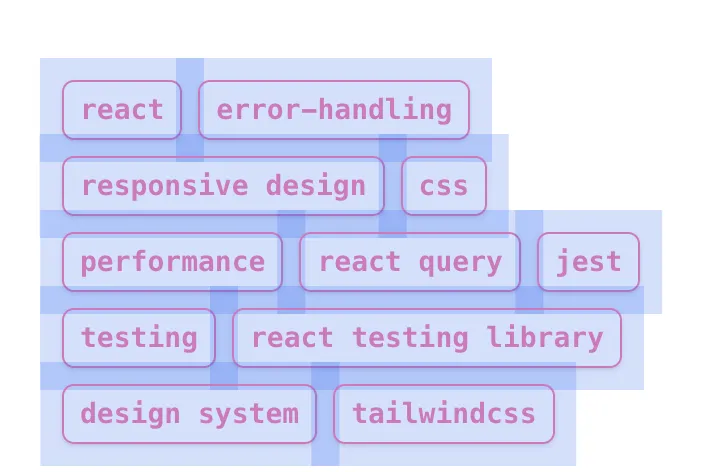
Expanding Touch Targets Without Affecting Layout
A simple technique to improve mobile usability by creating larger touch targets without disrupting your design
This solution comes from Adam Wathan’s bite-sized series on better UI solutions, specifically the Build UIs that don’t suck #3: What are these, buttons for ants? video.
Clickable elements should have large enough touch targets to accommodate fingers and thumbs, ensuring accurate interaction. If the touch area is too small, users may struggle to engage with buttons or links, leading to confusion and frustration.
For example, Google’s Material Design recommends a touch target of 48x48 pixels, which is a practical standard. However, there are various ways to achieve this.
Increase Interactive Elements Size
To increase the size of an interactive element, you can adjust its size, padding, or margin. However, this may affect the layout of nearby elements, requiring further adjustments. Tracking these changes can become complicated, especially if the touch target size changes later. Using negative margins is an alternative, but it introduces dependencies on other DOM styles and might not consistently produce the desired outcome.
Invisible Touch Target Extender
Our preferred approach is to introduce a span as a child of the interactive element. This span is styled to expand the clickable area without affecting the layout of surrounding elements. It is positioned outside the normal document flow using absolute positioning.
Here’s an example where the span is nested inside a clickable anchor element. The span is centred, and its dimensions are adjusted to cover the parent element and extend beyond it as needed to meet the recommended 48x48 px click area:

<span class="absolute left-1/2 top-1/2 h-12 w-[calc(100%+3rem)] -translate-x-1/2 -translate-y-1/2 [@media(pointer:fine)]:hidden"/>With this addition, the Tag element is written like this:
<a class="relative" href="{href}"> <span class="absolute left-1/2 top-1/2 h-12 w-[calc(100%+3rem)] -translate-x-1/2 -translate-y-1/2 [@media(pointer:fine)]:hidden" ></span> {label}</a>Another important feature of this solution is the media query. For devices with precise interaction, like desktops with a mouse, we’ll hide the span that provides a larger touch target for finger-based interactions. Since mouse users don’t need this accommodation, it’s fine to remove the element.
[@media(pointer:fine)]:hidden;