Tasting The Rainbow of Colour Design Tokens
The blog covers creating a UI color palette using Github's design system Primer and TailwindCSS
Where’d You Get Those Colour Tokens, Bro?
I’ve mostly taken my influence from Github’s design system Primer. I decided to start with colours. Primer makes use of design token categories. Per their fantastic documentation.
-
Base Tokens: These are the raw, primitive tokens. They hold the basic values. Use them only as a guide for building functional and component patterns. Never use them directly in code or design.
- An example would be
colors.neutral.50which maps to a CSS variable declared in the root stylesheet--base-colour-neutral-50: 0deg 0% 81% || #CFCFCF.
- An example would be
-
Functional Tokens: These represent global UI patterns such as text, borders, shadows, and backgrounds. These are the most commonly used design tokens.
- An example would be
bgColour-defaultwhich maps to the base colour tokencolors.neutral.50.
- An example would be
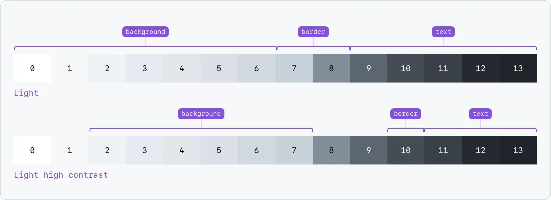
I took influence in how Primer approaches colour palettes. It breaks a palette up into functional ranges. For instance, the first six steps of the neutral scales are typically used for background colours, accessible with the functional token property bgColour. The two most commonly used background colours are bgColor-default (scale index 0) and bgColor-muted (scale index 1). All this information can be found on the Primer base scales page.
colors: { ..., ["site-palette"]: { blue: "hsl(var(--theme-text) / <alpha-value>)", grey: "hsl(var(--theme-bg-default) / <alpha-value>)" || "#CFCFCF", red: "hsl(0deg 100% 50% / <alpha-value>)", }}When creating a color palette, I wanted to keep TailwindCSS’s method of using a range from 50 to 950. I knew that site-palette.grey would be my default background colour, my bgColour-default, my starting point at index zero, my initial 50 step. To produce a Tailwind colour palette from this grey I used a Palette Generator tool by Simeon Griggs.
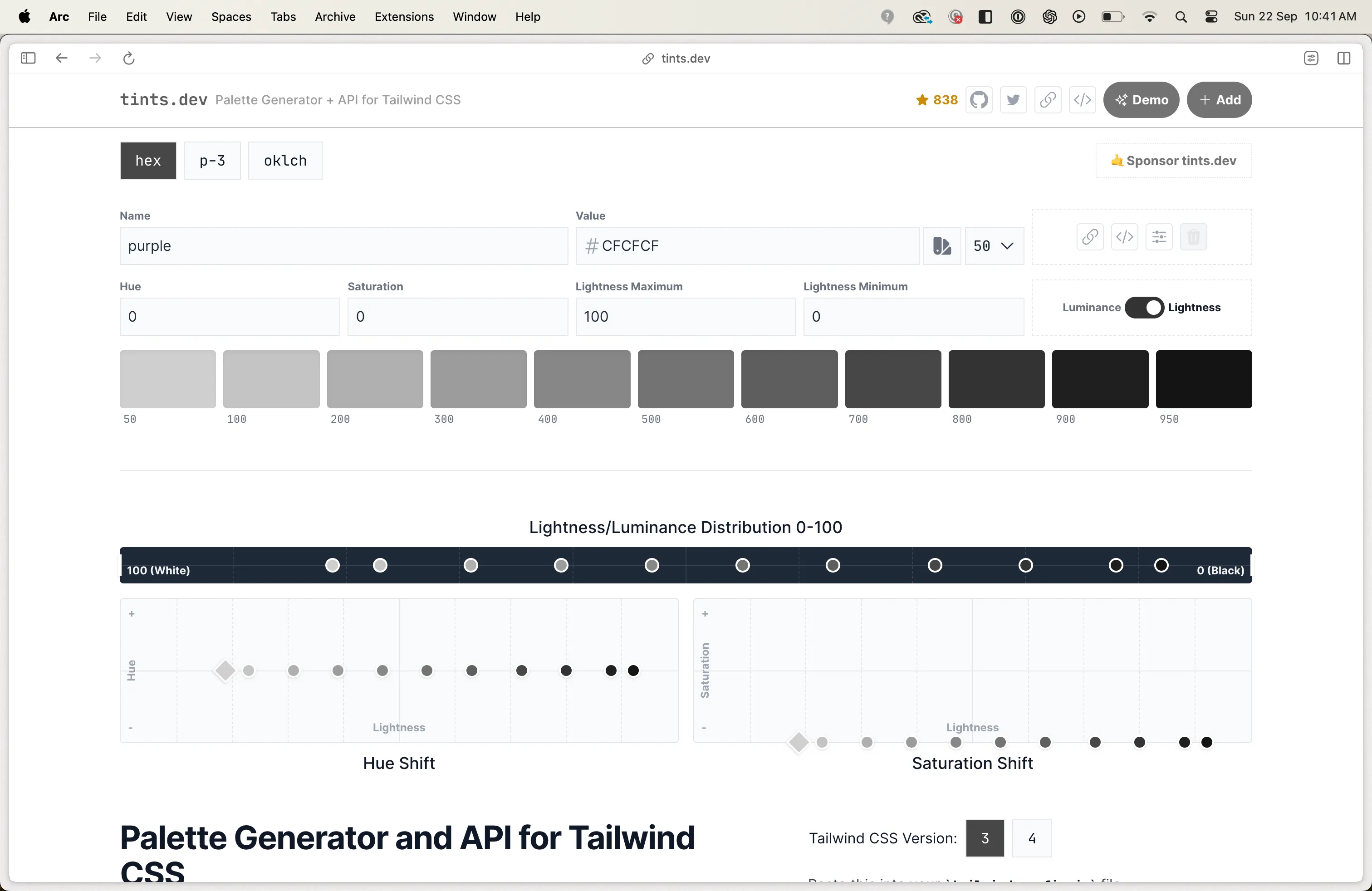
This generated me the following colour palette which I assigned as my neutral colour palette.
{ "colors": { "neutral": { 50: "#CFCFCF", 100: "#C4C4C4", 200: "#B0B0B0", 300: "#9C9C9C", 400: "#878787", 500: "#737373", 600: "#5E5E5E", 700: "#474747", 800: "#333333", 900: "#1F1F1F", 950: "#141414" } }}Following Primer’s approach, I decided to reserve the beginning of the colour range for backgrounds, the middle for borders, and the rest for high-contrast text and icons. This was the process of mapping base design tokens to their functional equivalents or colour utilities. From the neutral palette:
- The first block would be for background colours, usable through the
bgColour-*property. - The second block would be for borders, usable through the
borderColour-*property. - The third block would be for text and icons, usable through the
fgColour-*property.
Since I used site-palette.grey as my starting point, which was my current default background colour, I knew I had at least two functional tokens: bgColour-default and bgColour-muted.
["bgColour-default"]: baseColourTokens.neutral["50"],["bgColour-muted"]: baseColourTokens.neutral["100"],I set out to define my foreground range. Foreground colour tokens use the fgColour property and are applied to text and icons, a concept Primer outlines here and here. I started with an arbitrary choice: 700: "#474747", a shade on the darker end. Using a contrast checker, I tested this foreground colour against various background shades, ensuring it passed the minimum WCAG level AA accessibility standard. Meeting these guidelines makes content accessible to all, regardless of disability or device.
700: "#474747" was the minimum contrast for background colours between steps 50 and 200, but I wanted more. 800: "#333333" stretched the range, covering steps 50 to 300, while step 900 hit the mark for 300 and 400. Like Primer, I broke my neutral colour palette into its parts: background, borders, text, icons. The base colours were split and exposed as functional tokens. Simple, effective.
const baseColourTokens = { neutral: { // bgColour utilities 50: "hsl(var(--base-colour-neutral-50) / <alpha-value>)", 100: "hsl(var(--base-colour-neutral-100) / <alpha-value>)", 200: "hsl(var(--base-colour-neutral-200) / <alpha-value>)", 300: "hsl(var(--base-colour-neutral-300) / <alpha-value>)", 400: "hsl(var(--base-colour-neutral-400) / <alpha-value>)", // borderColour utilities 500: "hsl(var(--base-colour-neutral-500) / <alpha-value>)", 600: "hsl(var(--base-colour-neutral-600) / <alpha-value>)", 700: "hsl(var(--base-colour-neutral-700) / <alpha-value>)", // fgColour utilities 800: "hsl(var(--base-colour-neutral-800) / <alpha-value>)", 900: "hsl(var(--base-colour-neutral-900) / <alpha-value>)", 950: "hsl(var(--base-colour-neutral-950) / <alpha-value>)", },};
export const functionalColourTokens = { ["bgColour-default"]: baseColourTokens.neutral["50"], ["bgColour-muted"]: baseColourTokens.neutral["100"],};But how did I decide what my fgColour-default functional token was? I went back to Primer.
- Find what Primer uses for its default foreground token.
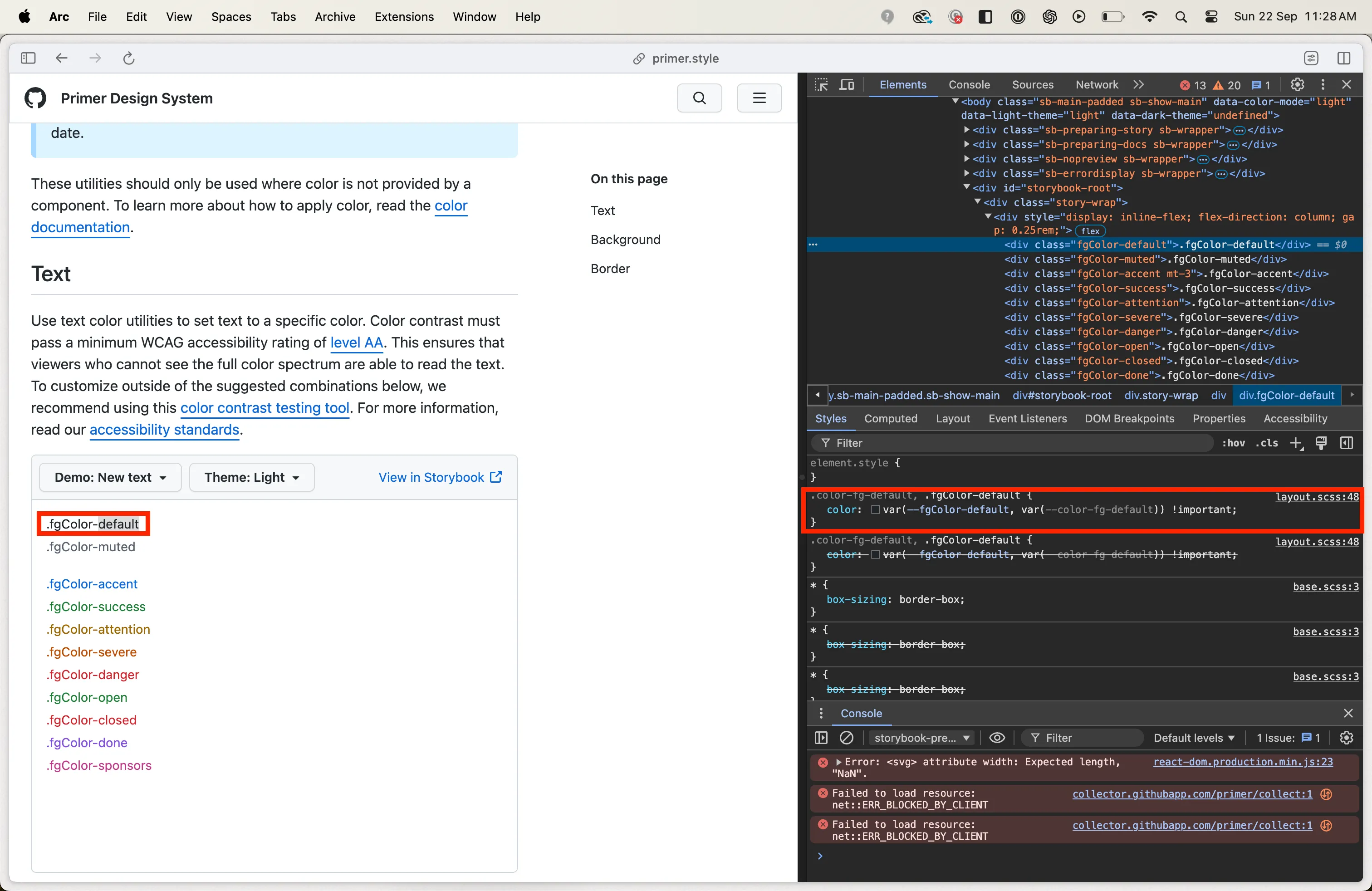
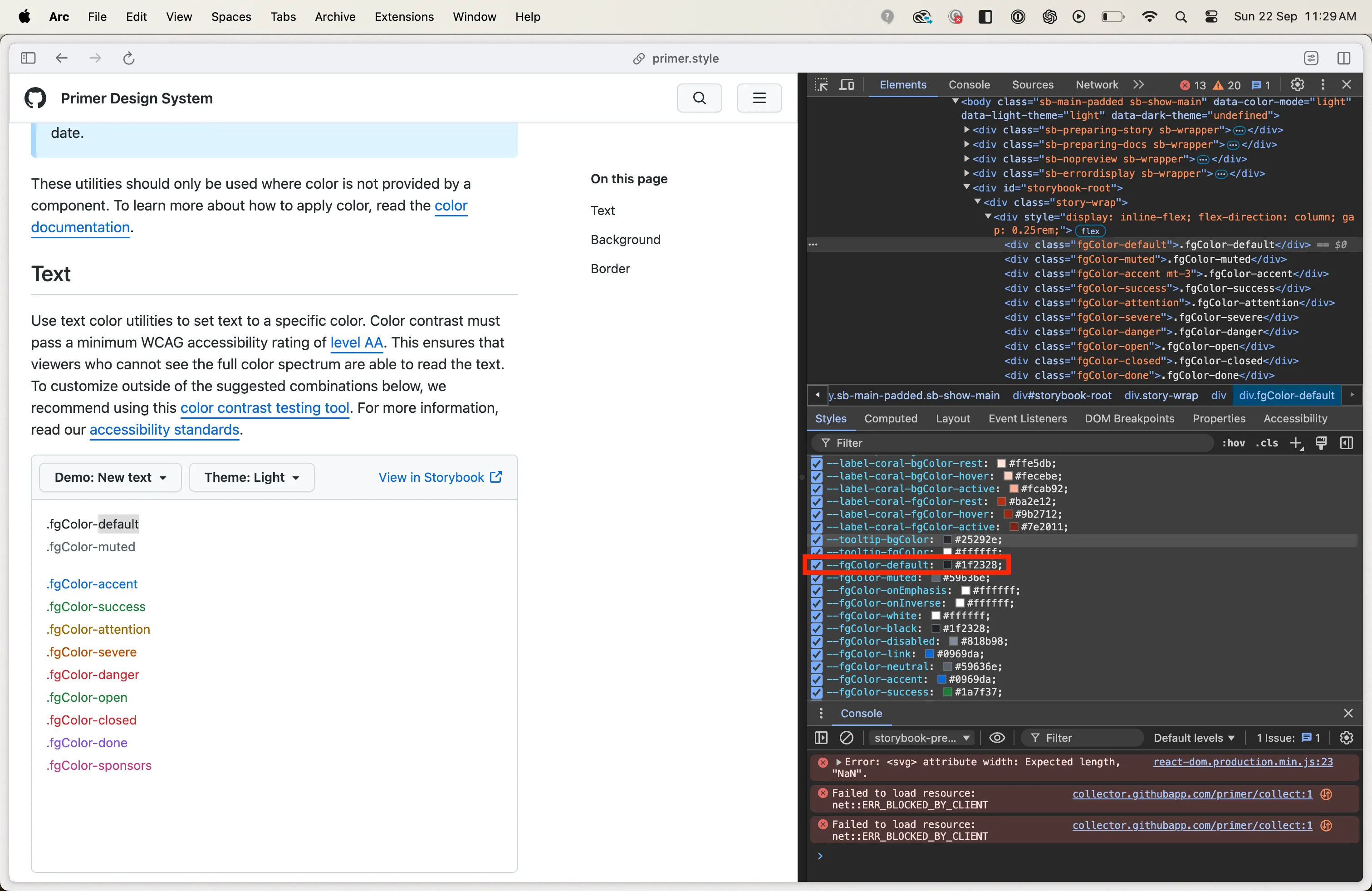
- Find the corresponding base colour token using Primer’s base scales resource.
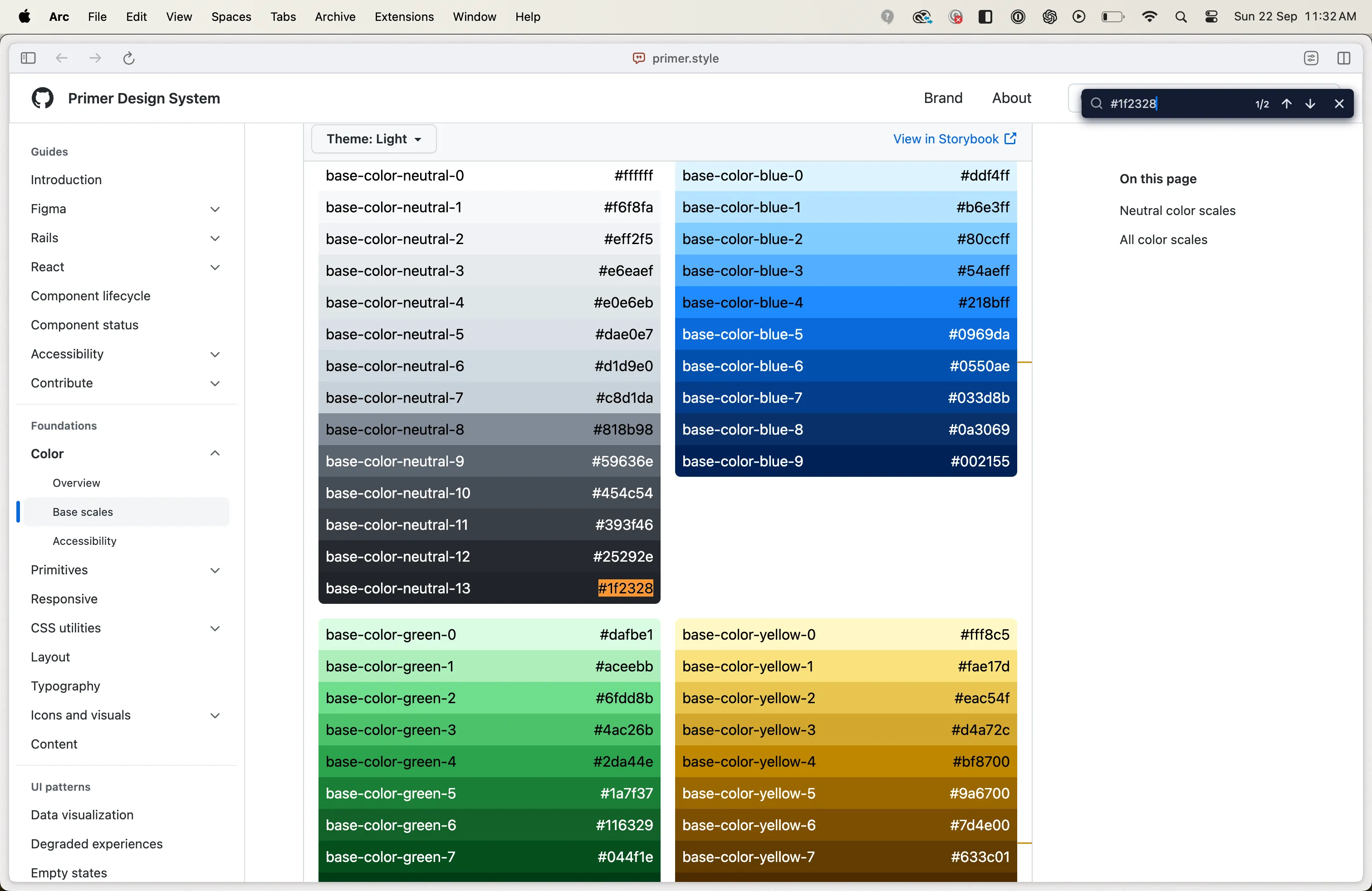
As can be seen fgColour-default for Primer maps to the darkest step in its neutral palette. This meant my fgColour-default was step 950: "#141414". I had my default foreground functional colour token. This ensured maximum contrast.
export const functionalColourTokens = { ..., ["fgColour-default"]: baseColourTokens.neutral["950"],};Applying the same method to Primer’s fgColor-muted led to base-color-neutral-9, the minimum contrast for text and icons. Since my minimum contrast is set at 800, this becomes my fgColour-muted token. Simple, straightforward, and functional.
export const functionalColourTokens = { ..., ["fgColour-default"]: baseColourTokens.neutral["950"], ["fgColour-muted"]: baseColourTokens.neutral["800"],};References
- Primer Base Scales: It offers a clear introduction to how a colour palette is divided into functional token ranges.
- Primer Colour Utilities: This helped me to understand the chunking up of base colour tokens into functional categories or utilities.