Why I Stopped Minding The Gap
Improve design flexibility with custom spacing utilities in TailwindCSS.
The Problem
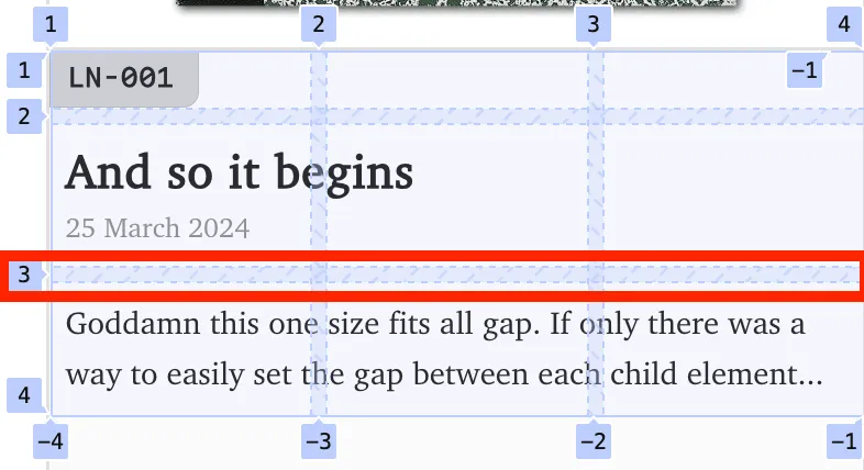
The gap utility is great, but it can be frustrating when you want different spacing between certain elements. For example, how can we add more space between the title “And so it begins” and the description “Goddamn this …”?
1. Margins
One way to handle it is by setting a margin on the description. A positive margin increases the gap, a negative one shrinks it.
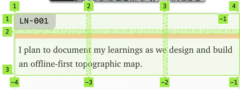
<div class="... grid gap-2"> <div class="..."> <p>And so it begins</p> <p>25 March 2024</p> </div> <div>class="mt-2 ..."> Goddamn this ...</div></div>But what if we removed the title and date? Suddenly, there’s more space (the red box below) between the top most tag (LN-001) and the description than we want.
So now we have to tweak our styles again—probably with a more specific rule. And this time, we’d need to make it conditional on the date not being there. For example:
const showDescription: boolean;
<div class="grid gap-2 ..."> ... <div class={`... ${showDescription ? "mt-2" : ""}`}> Goddamn this ... </div></div>I’m sure there’s a pure CSS way to solve this using :has or something similar, but I need a solution that works within TailwindCSS. The downside with this approach is how much HTML and CSS we’ve had to tweak just to control the gap for the description element.
2. Another Gap Between Nested Elements
Another option is to wrap the title, date, and description in a new container. Then we can apply a specific gap to that container, effectively overriding the original spacing by scoping it differently and setting the gap we actually want.
<div class="... grid gap-2"> <div class="grid gap-1"> <div class="..."> <p>And so it begins</p> <p>25 March 2024</p> </div> <div>class="mt-2 ..."> Goddamn this ...</div> </div></div>The obvious downside is that we’ve had to change the HTML just to get the spacing right. And in this case, we also need to make sure the grid styling stays consistent between the original parent grid (whose gap we’re overriding) and the new child grid we’ve added. It works—but it’s a bit of a tedious fix.
3. Don’t Use Gap. Use a Utility
Andy Bell came up with a flow utility that solves this problem perfectly. Instead of relying on gap, we can define our own utility that lets elements control the space between themselves. By using CSS variables and a custom utility class like flow, we keep the benefits of using gap for layout, while giving individual elements the power to control their own spacing.
The lobotomised owl applies the styles to all child elements where the utility is used.
.flow { --flow-space: 1rem;}
.flow > * + * { margin-top: var(--flow-space);}<div class="flow ... grid"> <div class="..."> <p>And so it begins</p> <p>25 March 2024</p> </div> <div>class="[--flow-space:0.5rem] ..."> Goddamn this ...</div></div>References
- Ahmad Shadeed does a great job of advocating for this approach, proposing that is should be exposed as a “Self Gap” utility: https://ishadeed.com/article/self-gap/.
- Andy Bell introduces the Flow utility: https://24ways.org/2018/managing-flow-and-rhythm-with-css-custom-properties/.